Sr. UX Designer
PRODUCT SPACE
Trimble is a global company with many applications and tools in the construction and civil engineering space. The focus of this project is a feature in a collaboration tool called Trimble Connect. Inside Trimble Connect, many users of the construction industry such as Architects, Engineers, and Civil Contractors can collaborate in a digital space. They use a digital model that represents building data to compare that to the onsite objects being constructed.
Trimble is a global company with many applications and tools in the construction and civil engineering space. The focus of this project is a feature in a collaboration tool called Trimble Connect. Inside Trimble Connect, many users of the construction industry such as Architects, Engineers, and Civil Contractors can collaborate in a digital space. They use a digital model that represents building data to compare that to the onsite objects being constructed.
PROBLEM SPACE
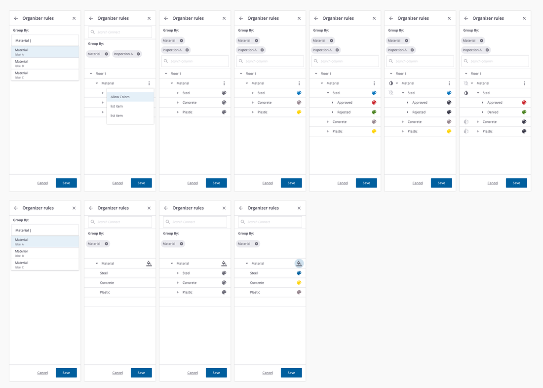
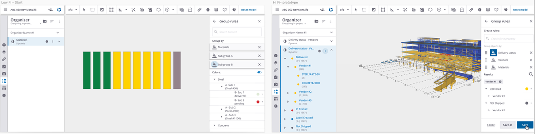
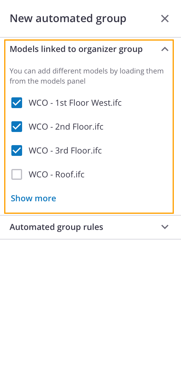
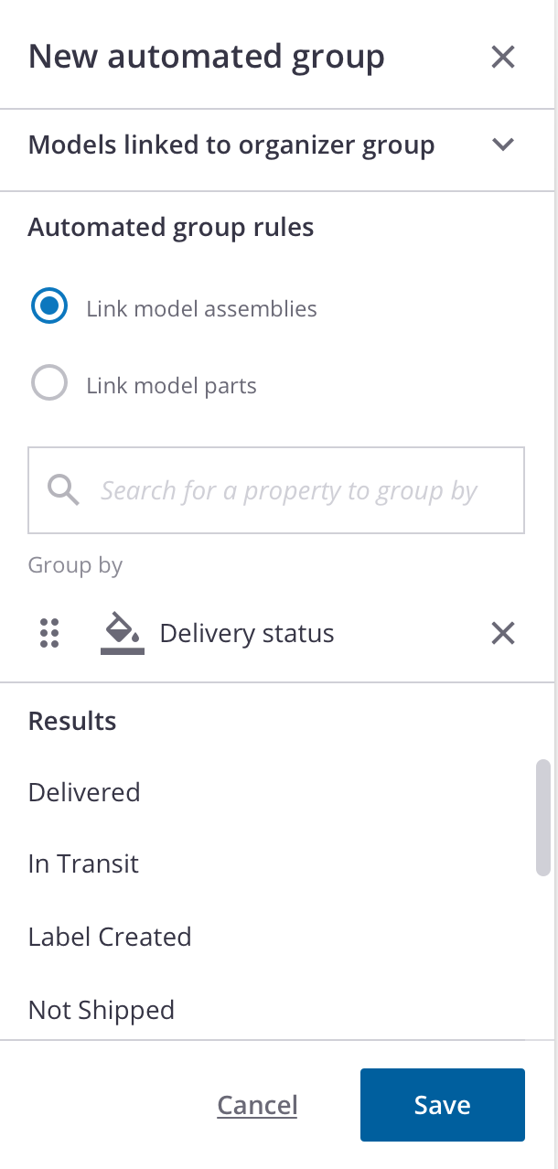
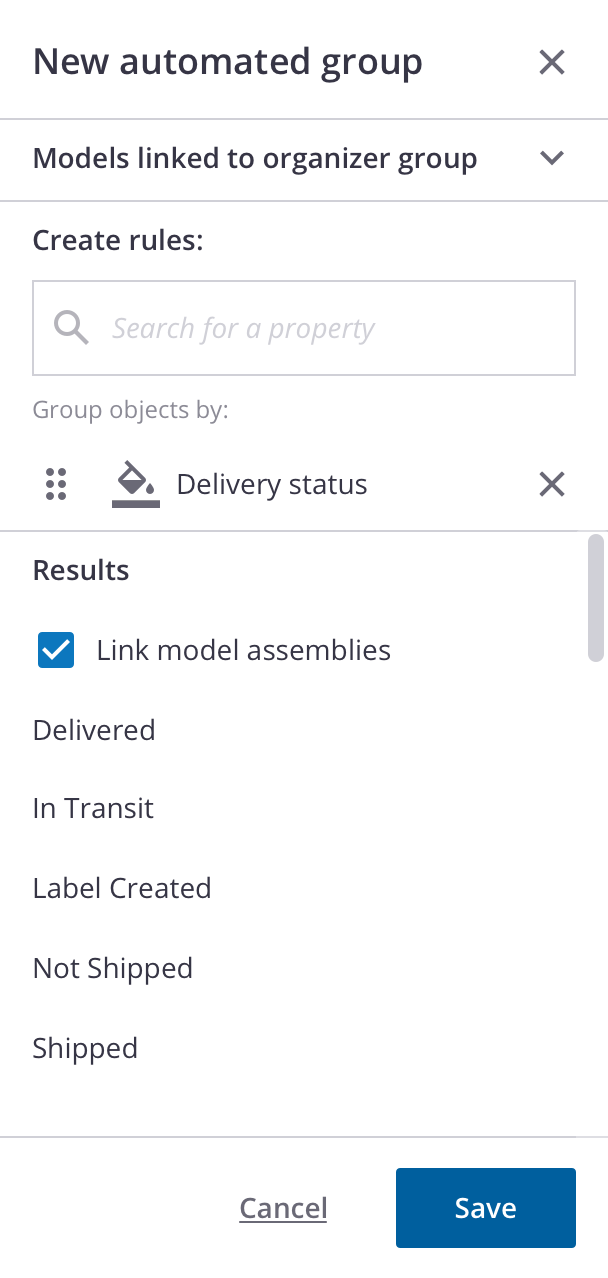
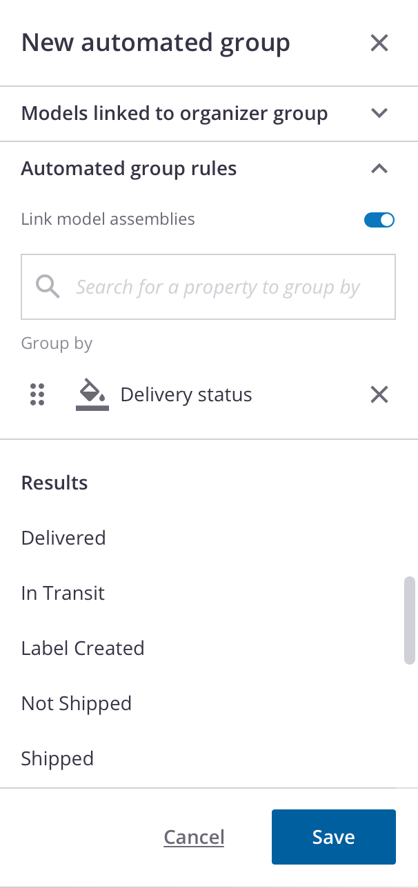
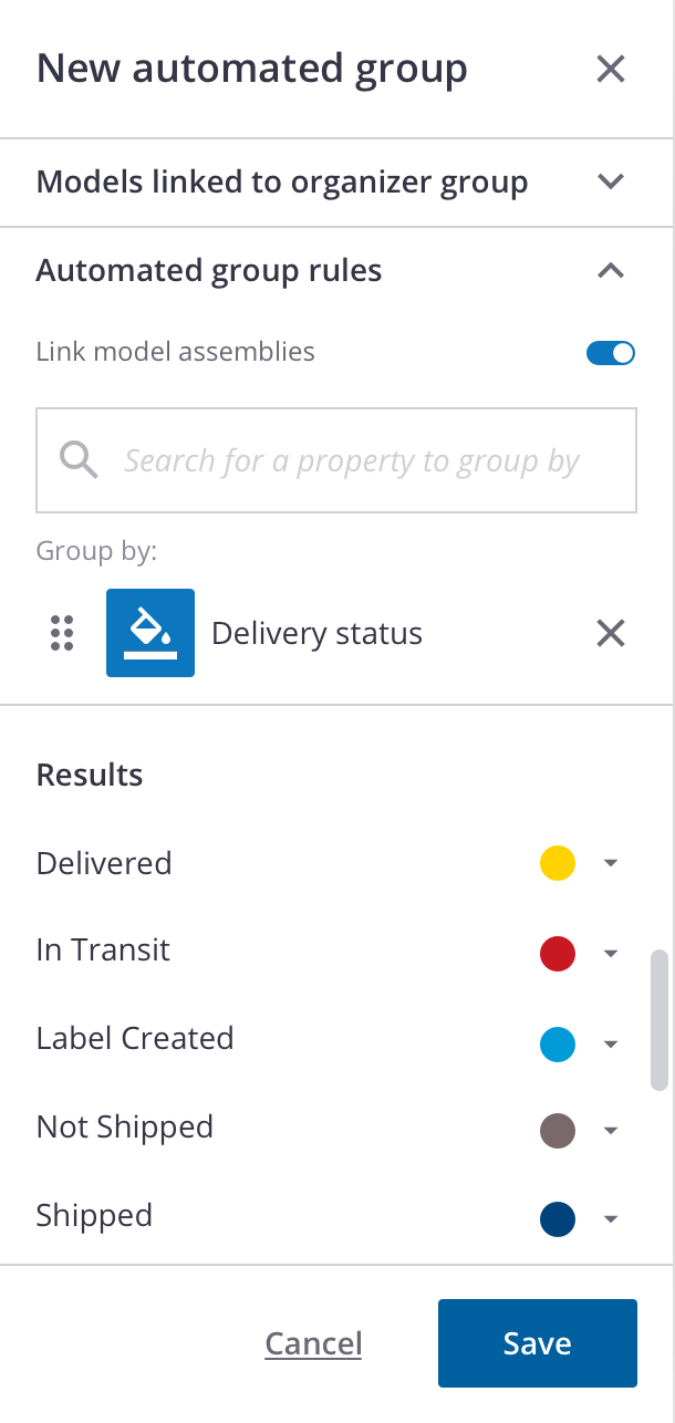
Creating an automated group using "rules" based on building model objects' properties.
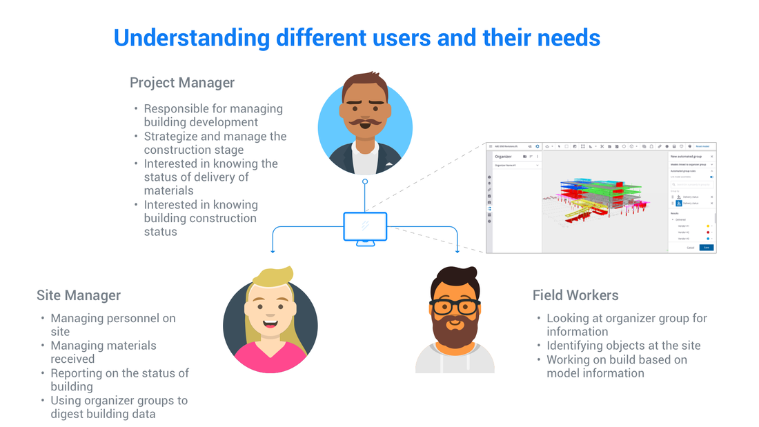
A digital model of a building is a representation of what will be built in real life. Inside that model contains a lot of information about the objects that go into the construction of the building, ex: steel, pipes, type of concrete slabs, and many more. These objects have data attributes that show their properties. Object properties identify their materials, vendor origins, dimensions, and many more. People in the construction pipelines use these properties to organize their building workflow in many different scenarios. For this use case, we are focusing on the "delivery-status".
As a BIM ( Building Information Modeling) manager or project manager, at the office, I want to see the status of materials being delivered to my site. I want to see which vendor they are coming from and their status. In the past, this persona can search for these properties manually and group them into an organizer group and pass it to the onsite persona to check. However, the digital models of the building change often as it gets updated, forcing the user to have to go back into the previously created organizer group and manually re-link objects into the group. This process is cumbersome and is prone to human error, which could be cause delays and drive up costs for the construction project.
The idea for the "automated group" inside the organizer is to avoid the manual linking of objects, but have the objects linked to a group based on a rule targeting their properties. This way, if the building information is changed or is updated, the group automatically updates without the persona having to coming in to relink. This would eliminate a lot of pain points and speed up the work process for our users.
Creating an automated group using "rules" based on building model objects' properties.
A digital model of a building is a representation of what will be built in real life. Inside that model contains a lot of information about the objects that go into the construction of the building, ex: steel, pipes, type of concrete slabs, and many more. These objects have data attributes that show their properties. Object properties identify their materials, vendor origins, dimensions, and many more. People in the construction pipelines use these properties to organize their building workflow in many different scenarios. For this use case, we are focusing on the "delivery-status".
As a BIM ( Building Information Modeling) manager or project manager, at the office, I want to see the status of materials being delivered to my site. I want to see which vendor they are coming from and their status. In the past, this persona can search for these properties manually and group them into an organizer group and pass it to the onsite persona to check. However, the digital models of the building change often as it gets updated, forcing the user to have to go back into the previously created organizer group and manually re-link objects into the group. This process is cumbersome and is prone to human error, which could be cause delays and drive up costs for the construction project.
The idea for the "automated group" inside the organizer is to avoid the manual linking of objects, but have the objects linked to a group based on a rule targeting their properties. This way, if the building information is changed or is updated, the group automatically updates without the persona having to coming in to relink. This would eliminate a lot of pain points and speed up the work process for our users.
BUSINESS INCENTIVES
If we can offer this feature to our customers, we can be competitive in the construction software industry. This is also a good opportunity to add colorization, a frequently requested feature, from our customer. Developing and launching an automatic organizer group with the capabilities to visualize progress via a color scheme will give our customers a useful and delightful feature.
If we can offer this feature to our customers, we can be competitive in the construction software industry. This is also a good opportunity to add colorization, a frequently requested feature, from our customer. Developing and launching an automatic organizer group with the capabilities to visualize progress via a color scheme will give our customers a useful and delightful feature.